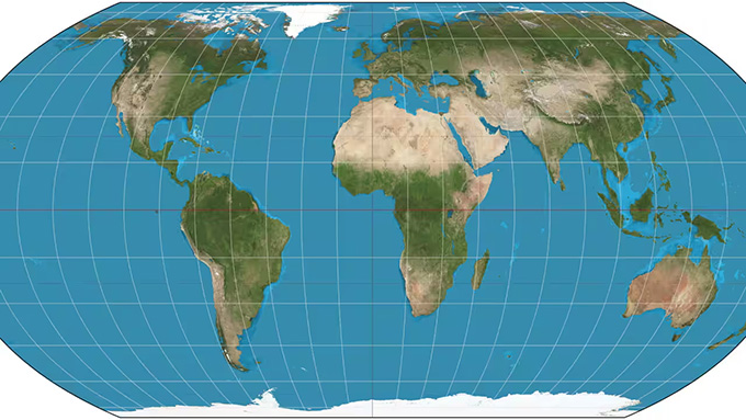
In March 2017, a news story about school maps caught the attention of three cartographers . Boston public schools had announced they would be using the Gall-Peters equal-area projection . This would show the size of each continent in relation to the others.
The media presented the change as a way to correct the world map designed by Gerardus Mercator (1512-1594). This geographer, mathematician, and cartographer, author of the concept of a “world atlas,” devised a map projection system during the Renaissance that preserved angles and local shapes, but not sizes. Mercator exaggerated the size of landmasses near the poles compared to others. However, with the Gall-Peters projection —first described in 1855 by James Gall (1808-1895)—all regions have their correct relative size because it preserves areas.
A new, more ambitious projection
Cartographers Bojan Šavrič , Tom Patterson , and Bernhard Jenny also wanted to respect the size of the continents. But they were frustrated that the debate seemed to boil down to choosing between Mercator and Gall-Peters, as there were many other options.
They sought a projection that would preserve the surfaces in their actual proportions while also offering shapes with more pleasing and familiar contours. And, since none of them entirely convinced them, they decided to design a new one.
Keep the size, change the shape
The Earth has a curved surface; paper and screens are flat, so transferring one to the other requires distortions. A projection determines how these distortions are distributed and which properties are preserved.
The Mercator projection, introduced in 1569, allows for the representation of courses of constant bearing as straight lines. This property is useful for navigation. However, its scale increases towards the poles, making it unsuitable for directly comparing continental landmasses.
With this system, Greenland can appear almost as large as Africa, even though Africa occupies approximately fourteen times its area. The territory itself doesn’t change; what changes is the proportion in which it is represented.
Gall-Peters, on the other hand, does preserve that proportion. That’s why it’s called an equal-area projection. But preserving areas doesn’t mean preserving shapes. Here, tropical regions appear stretched from north to south. Polar regions are flattened.
The three cartographers had a specific question: Could they preserve proportions with contours that didn’t look too strange? As a guide, they used the Robinson projection , common in atlases and visually balanced. However, Robinson doesn’t perfectly preserve areas. They wanted a similar appearance, with that added condition.
First the design, then the equations
The work began by testing combinations of existing projections with computer tools. The authors experimented with the map’s curves and their proportions.
