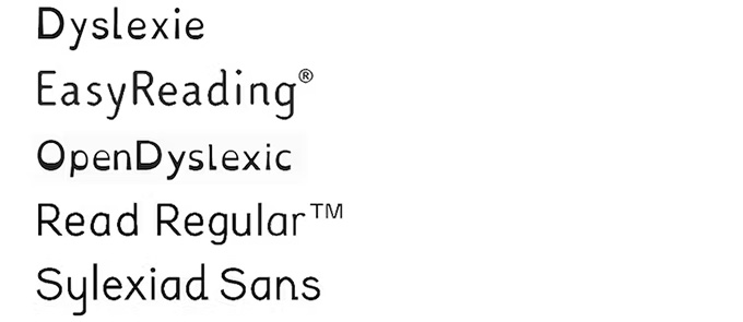
It is not uncommon to find, more and more, texts adapted with fonts specially designed to help people with dyslexia in reading . These are the fonts known in English as dyslexia friendly : Dyslexie, EasyReading(TM), OpenDyslexic, Read Regular(TM) and Sylexiad, among others. These sources have two main characteristics:
- Graphical features of the appearance of the letters to avoid confusion between letters with a similar shape (for example, p , b , d and q ).
- Greater separation between letters and words to reduce the effect of visual crowding : that is, the damage caused by surrounding visual elements in the recognition of a central element.
However, it is not clear if the scientific evidence supports the proposal of the designers of these specialized fonts: that people with dyslexia read texts written with them more easily. Let’s see what rigorous scientific studies tell us about it.

Fonts with special design written in your fonts.
Open Dyslexic
The Spanish researcher Luz Rello carried out a pioneering study of the ocular movements of Spanish dyslexic adults when they read a text written in Open Dyslexic. The results showed that the reading in Sans Serif fonts (such as Arial, Helvetica or Verdana: fonts that do not have “serif” or serifs at the end of the ends) in round form (without italics or bold) does not differ from that registered with the special font. However, the group of people with dyslexia interestingly noted that it was more unpleasant to read in Open Dyslexic than in the other sources.
A more recent study with North American schoolchildren with dyslexia showed similar results: the use of OpenDyslexic did not improve reading speed or accuracy. They also found that none of the participants preferred this font over the usual Arial and Times New Roman.
EasyReading(TM)
The effects of EasyReading(TM) have been compared to Times New Roman font in a study with Italian schoolchildren , with and without dyslexia. The specialized font produced an advantage in reading speed and accuracy in both groups. This suggests that EasyReading(TM) simply reads better than Times New Roman.
Unfortunately, EasyReading(TM) has not been tested against other fonts in the Sans Serif family, which appear to be easier to read, in general, than those in the Serif family.
Dyslexia
The possible advantages of this source have been analyzed in several studies. A study of Dutch schoolchildren with reading difficulties found no advantage of the Dyslexie font compared to Arial and Times New Roman fonts.
Other recent research compared the performance of English schoolchildren with dyslexia on various letter reading tasks in Dyslexie versus Calibri. The results did not show differences in reading sentences or isolated words. Dyslexie did show some advantage when it came to saying the names of the letters, although in reality this task cannot technically be considered reading.
In another study of Australian children with reading problems, reading in Dyslexie was found to be 7% faster than in Arial. However, when the letter spacing of the Arial font was increased to match that of Dislexie, the improvement in reading speed disappeared. According to the study authors, the effect of the Dyslexie font was not due to the special design of the letters but to the (greater) spacing between them.
We have not found quality scientific studies on the Read Regular(TM) and Sylexiad fonts.
Letter spacing
It is very likely that the spacing between letters is the key factor in making reading easier for people with dyslexia and not the special shape of the letters.
The benefit for people with dyslexia of slightly increasing the spacing between letters of common fonts (manipulation that anyone can perform with a common text editor) has been confirmed by several studies in Bosnian , English , French , Italian and Spanish .
Although there are also some studies with null effects in this regard, such as the one carried out recently with Polish schoolchildren with and without dyslexia. By analyzing their eye movements, they found that increasing the spacing between letters did not affect their accuracy, comprehension, or reading speed.
Finally, we must highlight the study by Joo et al , in which they verified that only a subgroup of North American adults with dyslexia read better when the text was represented with greater spacing between letters, words and lines; while the rest did not seem to be sensitive to those manipulations.
These authors suggest the existence of a subtype of dyslexia originating from a pronounced visual crowding effect. Therefore, increasing the spacing between letters, words and lines might be helpful only for these people, while it would be irrelevant for those with dyslexia caused by different factors.
Final recommendation
Ultimately, increasing the space between letters and between words might help some people with dyslexia. However, we still do not know the ultimate reason for the benefits associated with increasing the spacing between letters, so today its effectiveness cannot be generalized or guaranteed for all people with reading learning difficulties.
The British Dyslexia Association specifies ideal letter spacing at around 35% of the average letter width. In addition, he suggests using certain Sans Serif fonts, such as Arial and Comic Sans, in a size between 12 and 14 points.
Author Bios: Miguel Angel Perez-Sanchez is Professor of the Department of Basic Psychology and Methodology and Javier Marin Serrano is a University Professor. Psychology of Language. Psychology of Thought both at the University of Murcia
