
Graduate students interested in an academic career after graduation day have often been told they need to be open to moving somewhere they may not want to live. This advice is because of how hard it is to get a tenure-track professor position.
These days, this advice may be less relevant as graduate students are increasingly pursuing and ending up in careers outside of academia.
Where graduate students want to settle post-graduation has potential consequences for communities and states across the country that depend more and more on a steady stream of skilled workers to power their economies. Locations seen as undesirable may struggle to attract and retain the next generation of scientists, engineers, professors and other professions filled by today’s graduate students.
We are sociologists who are examining some of the factors that influence graduate students’ educational and career paths as part of a research project supported by the National Science Foundation. In March 2025 we distributed a survey to a sample of U.S.-based graduate students in five natural and social science disciplines: physics, chemistry, biology, psychology and sociology.
As part of our survey, we asked students to identify states they would prefer to live in and places where they would be unwilling to go. To some extent, our findings match some past anecdotes and evidence about the varying number of applications received for academic positions across different states or regions.
But little data has directly assessed students’ preferences, and our survey also provides some evidence that some states’ policies are having a negative impact on their ability to attract highly educated people.
Most preferred, most unwilling
For our study, we built our sample from the top 60 graduate programs for each of the five disciplines based on rankings from U.S. News and World Report. We received responses from nearly 2,000 students. Almost all of these students – 98%, specifically – are pursuing Ph.D.s in their respective fields.
As part of our survey, we asked students to identify locations where they would “prefer” to live and also those where they would be “unwilling” to live after finishing their graduate program. For each of these questions, we presented students with a list of all states along with the option of “outside of the United States.”
Just looking at the overall percentages, California tops the list of preferred places, with 49% of all survey-takers stating a preference to live there, followed by New York at 45% and Massachusetts with 41%.
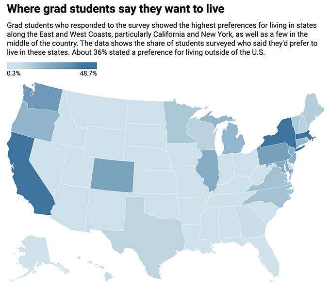
Results are based on a March survey of nearly 2,000 graduate students studying physics, chemistry, biology, psychology or sociology. A little over 8% of respondents said they have no preference.
Map: Source: Family, Place, and Career Survey of Graduate Students (Christopher Scheitle and Katie Corcoran, Principal Investigators
On the other hand, Alabama was selected most often as a state students said they’d be unwilling to move to, with 58% declaring they wouldn’t want to live there. This was followed by Mississippi and Arkansas, both with just above 50% saying they’d be unwilling to move to either state.

Results are based on a March survey of nearly 2,000 graduate students studying physics, chemistry, biology, psychology or sociology. About 22% of resopndents said there is no location they’d be unwilling to move to.
Map:
Clusters of preference
While the two lists in many respects appear like inversions of one another, there are some exceptions to that. Looking beyond the overall percentages for each survey question, we used statistical analysis to identify underlying groups or clusters of states that are more similar to each other across both the “prefer” and “unwilling” questions.
One cluster, represented by California, New York and Massachusetts, is characterized by a very high level of preference and a low level of unwillingness. About 35% to 50% of students expressed a preference for living in these places, while only 5% to 10% said they would be unwilling to live in them. The response of “outside of the United States” is also in this category, which is noteworthy given recent concerns about the current generation of Ph.D. students looking to leave the country and efforts by other nations to recruit them.

Results are based on a March survey of nearly 2,000 graduate students studying physics, chemistry, biology, psychology or sociology.
Map Source: Family, Place, and Career Survey of Graduate Students (Christopher Scheitle and Katie Corcoran, Principal Investigators
A second cluster represents states where the preference levels are a bit lower, 20% to 30%, and the unwillingness levels are a bit higher, 7% to 15%. Still, these are states for which graduate students hold generally favorable opinions about living in after finishing their programs. This cluster includes states such as Colorado, Illinois, Pennsylvania, Maryland and New Jersey.
A third group of states represents locations for which the rate of preference is similar to the rate of unwillingness, in the range of 10% to 20%. This cluster includes states such as Minnesota, Delaware and Virginia.
The fourth and fifth clusters consist of states where the rate of unwillingness exceeds the rate of preference, with the size of the gap distinguishing the two clusters. In the fourth cluster, at least some students – 5% to 10% – express a preference for living in them, while around 30% to 40% say they are unwilling to live in them. This cluster includes Florida, Montana, South Carolina and Utah.
Almost no students express a preference for living in the states contained in the fifth cluster, while the highest percentages – 40% to 60% – express an unwillingness to live in them. This cluster includes Alabama, Kansas, Oklahoma and South Dakota.
Signs of current politics
Many factors influence our preferences for where we want to live, including family, weather and how urban, rural or suburban it is. The politics of a community can also influence our perceptions of a place’s desirability.
Indeed, political factors may be of particular concern to graduate students. In recent years, some states have taken a more hostile stance toward specific academic disciplines, institutions of higher education in general, or professions that are of interest to graduate students. While states such as Florida and Texas have been leading such efforts, many others have followed.
Interestingly, our statistical grouping of states finds that students’ unwillingness to live in states such as Texas, Florida, Georgia and Ohio is higher than we would expect given those states’ corresponding preference levels. For example, about 10% of students selected Texas as a place they would prefer to live in after graduation. Looking at other states with similar preference levels, we would expect about 10% to 20% of students to say they are unwilling to live in Texas. Instead, this percentage is actually 37%. Similarly, 5% of students say they would prefer to live in Florida. Other states with this preference rate have an unwillingness rate of around 35%, but Florida’s is 45%.
Although our data does not tell us for sure, these gaps could be a function of these states’ own policies or alignment with federal policies seen as hostile to graduate students and their future employers.
These findings suggest that communities and employers in some states might continue to face particularly steep hurdles in recruiting graduate students for employment once they finish their degrees.
Author Bios: Christopher P. Scheitle is Associate Professor of Sociology, Katie Corcoran is Professor of Sociology and Taylor Remsburg is a Graduate Research Assistant in Sociology all at West Virginia University