How should you present yourself as an academic on the internet? It’s a vexed question. There are just so many options for making a ‘place’ where people can find out more about you that it can be hard to make a decision. I’ve been thinking about this since Blair wrote to me with a question:
I am in the final six months of my PhD and am currently starting to look for academic jobs. I have noticed that a lot of near PhD graduates have their own personal websites that showcase them, their research and experiences. I was wondering if you have written anything on creating one of these and what is the best way to do so and what to include?
Good question Blair – I’ve been so focussed on helping people negotiate the demands of social media and blogging I’ve neglected the good old, stand alone ‘home page’. Remember those? Just a simple page where you put a picture of yourself and some information, maybe some links. You make a home page out of code, or a simple editor link it to a domain you actually own. The idea seems curiously retro in this age of platforms and channels, but since I started to look into it in an attempt to answer Blair’s question, I’m starting to wonder: is the humble academic homepage making a comeback?
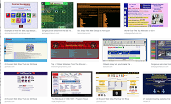
Image search for ‘home pages of the 90s’. Takes me back!
The idea of the home page that you edit yourself makes me nostalgic. I was born in 1970, so I remember a world before the internet – even before computers. My first memory of the internet is a friend showing me the text based browser ‘Lynx’ in 1993: we spent a fun afternoon doing this new thing called ‘surfing’. I used a dialup modem to connect to the university internet service in 1994, much to the annoyance of housemates who couldn’t receive incoming calls. If you can believe it, I still have a home-brewed home page, which I only just realised was last updated over ten years ago! I edited the code on this page by hand – which is why it’s nothing fancy. Interestingly, it doesn’t turn up in searches, perhaps because I have so much out there now (I guess I should update it, given that I haven’t worked at RMIT since 2012…).
Webpage aesthetics have changed so much over the decades. The first pages I saw were just green text on a black background. Then came visual browsers, Mosaic and Netscape, allowing pictures and even movement. This led to some truly horrible looking webpages, as most people do not have design training… Academics have always been early adopters of trends in self presentation on the internet. I remember academics making their own ‘home brewed’ webpages in the late 1990s; most were in maths, computer science or physics. You could tell they were Hard Core Scientists who didn’t need no Dreamweaver. Their pages have a recognisable aesthetic that is informed by simple implementation of html: plain white backgrounds, blue text for links and, if you were feeling fancy, perhaps a line break or two.
Non-sciencey academics didn’t seem to bother so much with having a webpage in the 90s, but by the early 00’s, even architecture academics were starting to put up custom built webpages to advertise their research. It made sense back then because University websites did not have content management systems, so getting your details up on the web was a painful process. But the so called ‘Web 2.0’ revolution happened, which signalled a decline in the webpage cottage industry. Suddenly there was things like LiveJournal, then Blogging platforms, later came Facebook and Linkedin and all the rest. Now academics have lots of options for sharing information about themselves and their research, including Academia.edu and ResearchGate, who are both hopeful start ups who want you to spend time making their platform look lively.
As someone said: “If it’s free, YOU are the product”. The problem with so many of these platforms is that you don’t own the data you put on them. Nor can you control what the data you enter into these sites is used for and how much it will generate annoying advertising directed at you (if I see another menopause cure…!). Although I love the convenience of large platforms, and the immediate networks they open up, I think the humble, stand alone webpage has a lot to offer your average academic in terms of self presentation. I asked on Twitter and people sent me a broad range of examples that demonstrated the contemporary, stand alone academic homepage comes in many shapes and sizes.
The home page of David Stern at the Crawford School at ANU is pleasingly simple and shows you don’t have to really push the boat out, design wise, to communicate effectively who you are and what you are about. Likewise Seamus Albion has a charmingly 90’s style page that projects ‘serious academic’ as well as anything. Michael Bulmer sticks with a simple aesthetic, but through his placement of texts and images gives us a hint of his personality too. Ben Swift, a design academic at ANU, had one of the more sophisticated ‘home-brew’ pages I looked at. Interestingly, Ben’s first picture is of his back – which works really well. Most of us would not make such a brave design choice, but you would expect that from a design academic! Alexandra Hogan has a very neatly organised and approachable page, that I quite envy. I also really likedLaura Portwood’s page for the same reason. Both these pages made me reflect on how important the photo of the person is to a page design and how a different emphasis on the portrait can create a very different sense of who the person is.
I asked a few people about what they thought the value of a self owned, self managed webpage was for academics. Most said they liked the simplicity and control the humble homepage offers to ‘package’ their academic identity. As Andrew Glassner put it: “I hope it offers people a sense of the work I do and the things I’m interested in, and it lets me keep these projects organized and in one place. It’s also a single resource to point people to for a CV, or article, book summary, artwork, etc.”. Of course, having a place for people to find out more about you is not a bad idea when you are job hunting, Cadace Lapan put one up and noticed “bumps in page views” when she was looking, although no employer ever mentioned they looked at it. I guess the key advantage of a simple home page is there are no comments to manage!
In my Twitter conversations, some academics, unsurprisingly all women, told me that their decision to maintain their own presence online had raised eyebrows around the workplace. One told me: “I have been questioned at work why I would want one separate to my standard university-provided page, but I strongly feel that building an independent academic online presence is important.” She noted that lab heads in science disciplines will often have one. Perhaps, if you are seen to be coping the ‘higher ups’, you can be perceived as an upstart? Or perhaps it’s just mundane patriarchal crap: policing women’s behaviour is as rampant in academia as it is everywhere.
To get back to Blair’s question, if you are to make a home page, what should you include? Start with a simple picture and bio, written in the first person. This is enough for a useful placeholder and you can use the rest of the space to direct people to other sites, such as your research page at the uni, Linkedin, or your blog. If you’re enthusiastic, you could set up a couple of linked pages to showcase your research and projects, but bear in mind you’ll have to do some routine maintenance to keep it up to date. Don’t forget contact details! I think you should give some serious thought to the images you use, especially if you plan to include a photo. I don’t think you need to have a serious professional portrait taken: you might have one on your phone that better represents your personality and approach to life and work. A little bit of simple fiddling with the photo editor on the phone can make it look nicer (I use SnapSeed on the iPhone). If in doubt, turn the picture black and white – a trick I learned in design school to make it look like you made an effort.
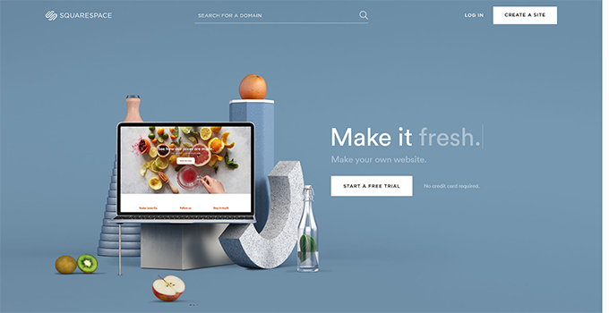
Check out what other people in your discipline are doing, but be bold. Express yourself! If you’re keen to make your own, home-brew, artisanal homepage, there’s some tools that make it much easier. Squarespace is a service where you can pay to craft and host extremely professional looking sites. My friend Narelle Lemon uses this for her Explore and Create Co project, which looks very fancy. When I questioned the cost (it’s not inexpensive) she wisely pointed out that it was the same amount of money as a nice new pair of jeans – and at least as useful. My sister Anitra Nottingham uses Wix, which is a similar product to Squarespace – no doubt there are more. If you’re looking for something cheaper, a few people pointed me at Carrd seems to be a good option, or you can use a free service like WordPress, my preferred blogging platform.
I’m inspired to go back and fix my old home page now! I’d love to hear your experience of making your own home page – and see some examples in the comments